

Math… For Her: Shoddy Goods 074
A calculator for women? Really?
Hey, Jason Toon here, with another Shoddy Goods, the newsletter from Meh about consumer culture. It’s easy to make fun of clueless “for her” versions of genderless products. So I will!
If anything is ungendered, you’d think math would be. The square root of 144 is always 12, whatever your particular chromosomal arrangement. Anything multiplied by 1 still equals itself, no matter where that self defines its place on the gender spectrum.
A major business technology concern like Adler should know that. You don’t go from a humble bicycle manufacturer to the world’s sixth-largest manufacturer of office machines if you don’t understand numbers. And yet, in 1975, that didn’t stop them from marketing a pocket calculator “for women”.
Press the ladybuttons to enter ladynumbers and ladycalculate the ladymath
“Designed for milady”
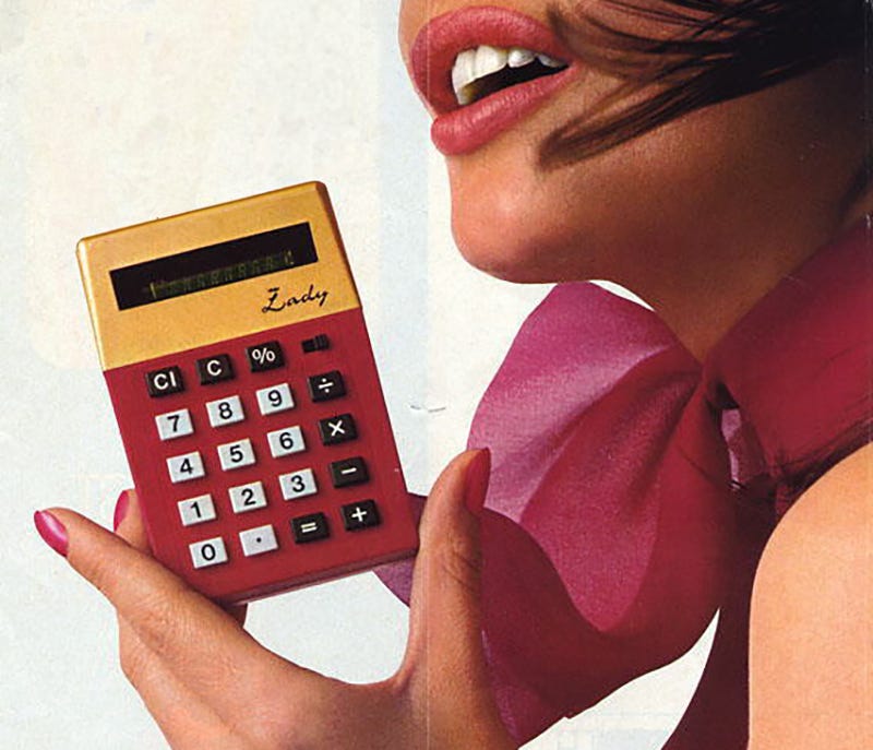
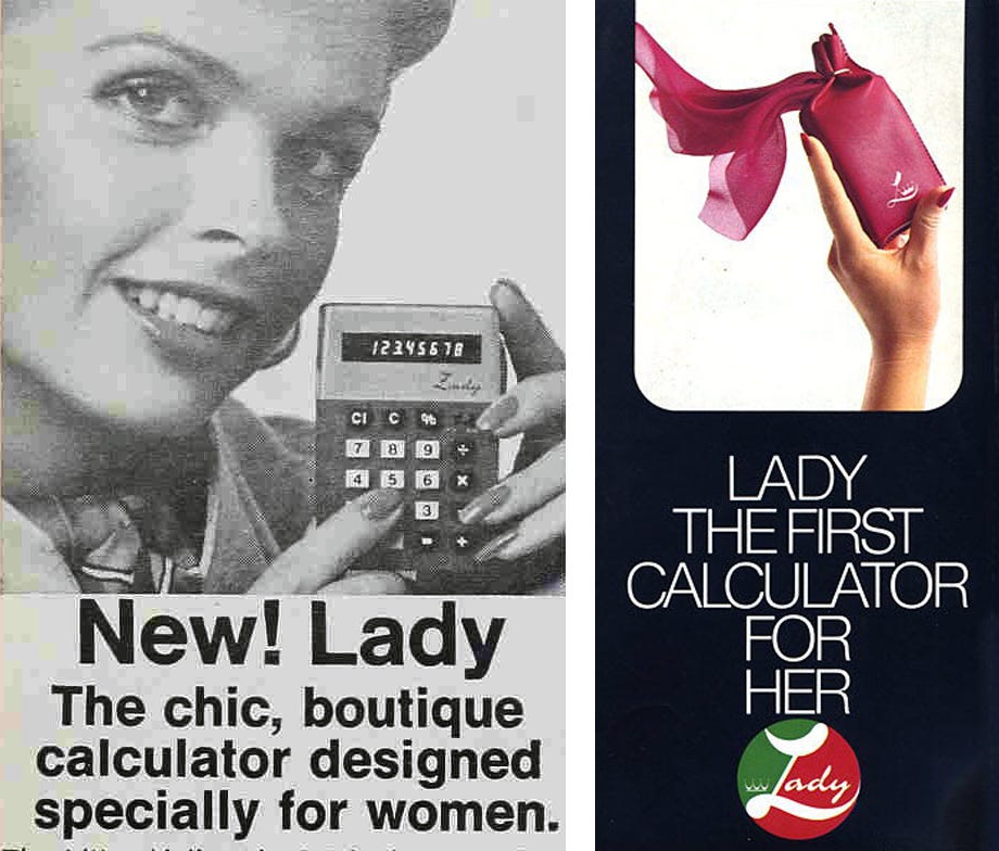
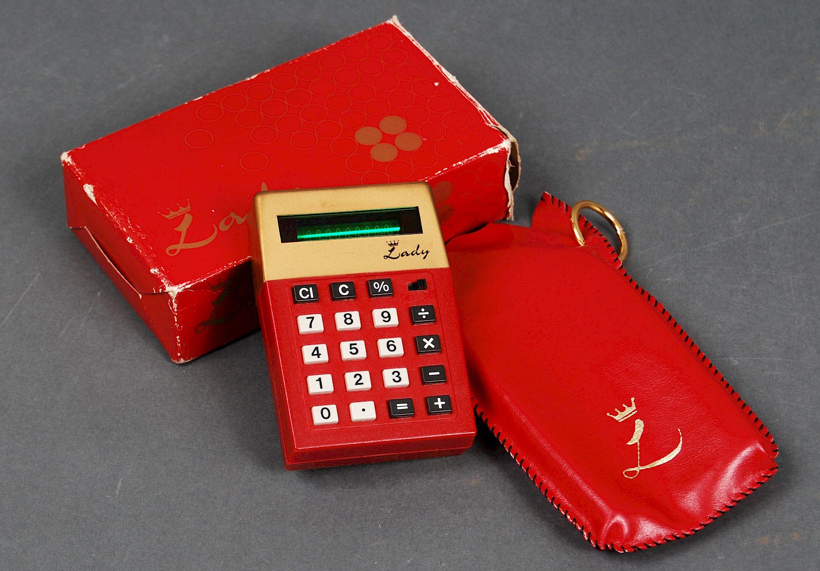
“The chic, boutique calculator designed specially for women,” ran the ads that started appearing in fall of that year. “The Litton/Adler ‘Lady’ is the only electronic calculator specifically designed for milady.” [shudder] You can feel the ad tipping its fedora. “Ruby red and gold tone create a truly striking conversation piece… slips easily into the smallest purse.”
A Mother’s Day campaign the following year calls the Lady “the electronic calculator that recognizes there’s a difference between men and women… a daring departure from drab black and white… tinier than a regular size pack of cigarettes.” The ad copy goes on to helpfully reminds the fairer sex of all that mean old math that the Lady could help with: “it’s ideal for check book balancing, preparing tax returns, supermarket shopping.”
If Barbie and Ken were rudimentary computers
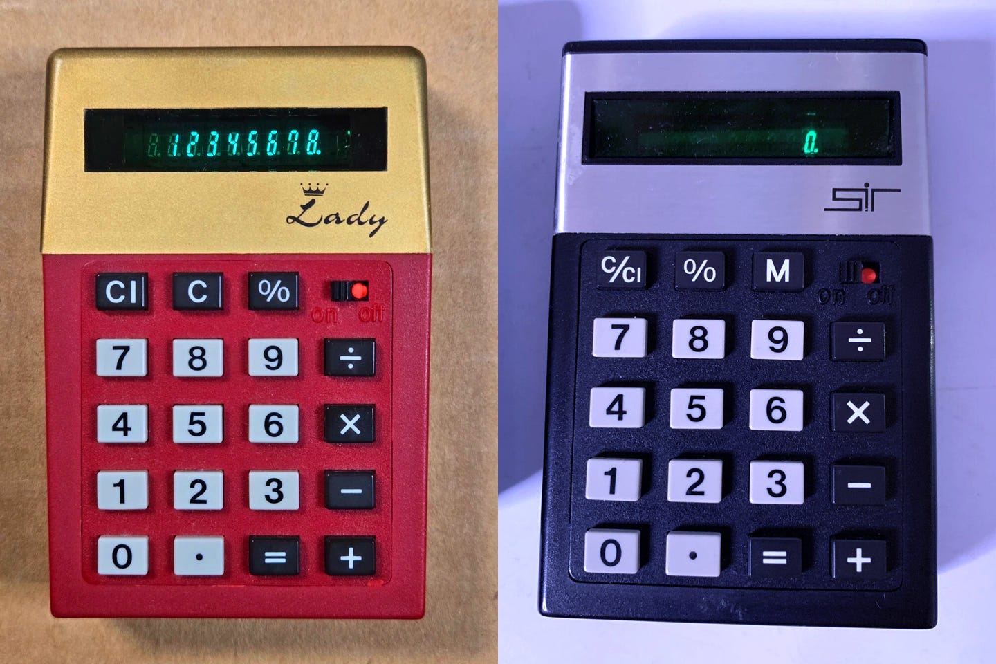
Lest anyone suspect Adler of white-knighting for the gals, they came up with a little something for the fellas, too: the Sir, a masculine companion in non-nonsense silver and black… meaning it looks like a regular old non-gender-specific calculator, if a bit ahead of its time. If there’s anything sillier than a calculator for women, it’s a calculator for men.
Each one came with its own little leather carrying case: a soft scarlet pouch with a gold keyring for the Lady, a rugged black wallet for the Sir. Hmm, you know, the barricade of a thin layer of leather could be a pretty good way to discourage you from compulsively looking at your phone. [adds note to “Million-Dollar Ideas” file]
Tron vs. Barbarella
Here’s the thing: the Lady is indeed a “striking” piece of ‘70s industrial design. The deep red and gold color scheme really pops, of course. But the subtle form factor differences are distinctive, too. Where the Sir is all right angles, the Lady tapers toward the ends to form a gently irregular hexagon, with more rounded top corners.
The Sir’s design was also pretty bold for 1975. Where it foreshadows ‘80s aesthetics, the Lady hangs on to more of a late-’60s, early-’70s retro-future vibe. The Sir is Tron and Battlestar Galactica while the Lady is 2001 and Barbarella. None of which, of course, has anything to do with gender.
At least the Adler boys had the restraint not to spell out 5318008 on the screen
Predictably, the gendered marketing of these two pretty neat little calculators didn’t do them any favors. There’s a fine line between targeting your audience and limiting your audience. As with the Bic for Her fiasco 37 years later, if the manufacturer had just rolled out these new designs sans sexual designations and let the public make up their own minds about who they were “for”, they probably would’ve sold better.
Or at least, not any worse. By 1977, Adler stopped marketing both the Lady and the Sir. They’re remembered fondly by vintage calculator enthusiasts. Both pop up on eBay and Etsy regularly, especially the Lady; you can probably land one for $20-$30, depending on condition.
The Lady in Red
Looking back from 50 years later, what strikes me is how little the Lady’s design would read as “for her” today. Even if feminine product design has evolved beyond cliched pink and purple pastels and flowing curves (looking at you again, Bic for Her), the dominant mood of women-coded products could still be summed up as “calm”. The Lady’s brassy colors and harder edges are much more in-your-face.
Maybe the Lady wasn’t “feminine” because of the particular aesthetic as much as the presence of any aesthetic sense at all. I guess a male calculator operator must be too busy conducting serious business to fool around with fripperies like vivid colors and stylized lettering.
Or maybe trying to pin down his-and-hers style is inherently doomed to be inexact and quickly dated, because visual indicators of gender change across different times and places. Unlike, you know, math.
I’m secure enough in my masculinity to admit this calculator set is freaking badass
I love the Japanese snack Pocky sticks in all their flavors, but I’ve always been mystified that there’s a Pocky for Men…flavor. Have you seen any other weird “for men” or “for women” type of products that make no sense other than some marketer thinking they have a cheap way to increase sales? Let’s talk about ‘em in this week’s Shoddy Goods chat.
—Dave (and the rest of Meh)
You don’t have to own any particular equipment to enjoy these gender-neutral Shoddy Goods stories: