

Kellogg's gets visual: Shoddy Goods 066
The birth of the cereal box as we know it
Rise and shine for a hearty bowl of Shoddy Goods, the newsletter from Meh about consumer culture. I’m Jason Toon and this week, we’re looking at a pop art icon before it became iconic.
Think of a cereal box. You’re picturing a tall, shallow rectangle with the product’s name above a full-color picture of a bowl full of cereal, right? Maybe there’s another big illustration: a cartoon character, a celebrity, a key ingredient. Walk down the cereal aisle at any grocery store and every single box will fit this description. It’s probably been like that as long as you can remember. The cereal box seems eternal, universal, natural.
Of course, it isn’t. It’s something people made, on purpose, for reasons. Dry cereal was originally packaged in plainer, text-heavy packages, befitting its origins as health food. We can pretty much pinpoint when the cereal box as we know it was born: spring, 1952. And this change closely followed the way cereal itself was changing.
(Serving suggestion)
K-Day and cereal bop
“It was like suddenly discovering the freckle-faced girl next door had blossomed into a raving beauty.” So said, supposedly, a housewife quoted in a three-page advertising spread in the April 14, 1952 Life magazine.
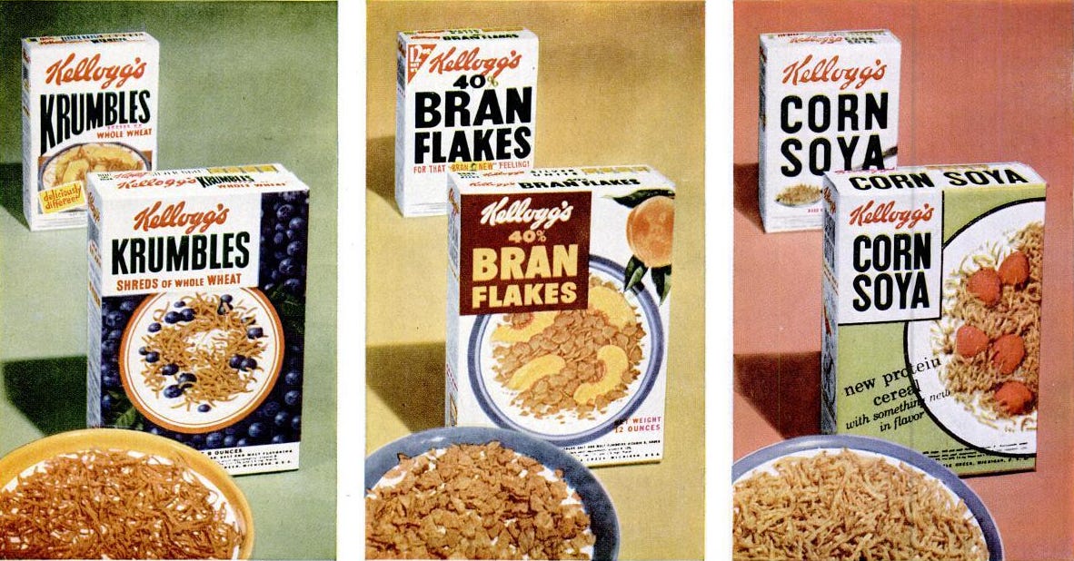
The occasion: new packages for the entire line of Kellogg’s packaged cereals. The Battle Creek behemoth wasn’t playing around. In 1952, three full-color pages in Life magazine was basically the equivalent of a Super Bowl ad.
“Avoiding conventional design, these new packages take their inspiration from magazine covers,” the ad copy said. “In Battle Creek, they call it ‘K Day’. In your town, it will probable be one day in April when you will walk into your grocer’s and see the cereal section fairly singing with new Kellogg’s packages.”
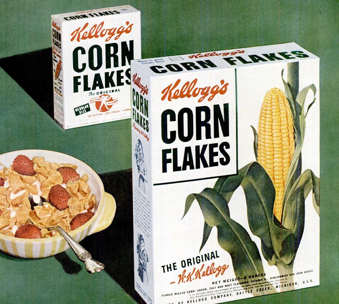
Nothing says breakfast time like corn on the cob
All of the new boxes have the cereal’s name in the same block letters in a box at top left, except Pep, which is allowed the luxury of its own logo. On most of them, the rest of the front is taken up by a full-color photo of a bowl of the cereal, garnished with fresh fruit.
Some of the less photogenic cereals stay hidden in favor of a celebrity endorsement like actor Guy Madison, TV’s Wild Bill Hickock. Or a more conceptual illustration, like the dancing couple on the All-Bran box intended to evoke “youthful regularity.” (I guess there are worse ways to represent that concept: one previous All-Bran box had “for constipation!” blaring across the front, while another touted its “laxative” effects.)
The backs of the boxes would be new, too, with Kellogg’s promising “new recipes, games, cutouts, and stories for children,” among other morning reading material: “Although purists of etiquette may frown, most folks bring cereal packages to the breakfast table.”
This parade of packages wasn’t just limited to Life. All month, heavy magazine, newspaper, and TV advertising touted the “Kellogg’s All-Star Breakfast Show”. In-store displays featured Howdy Doody and free balloons. This catchy commercial captures the thrill of a world where Rice Krispies “sing a kind of cereal bop.”
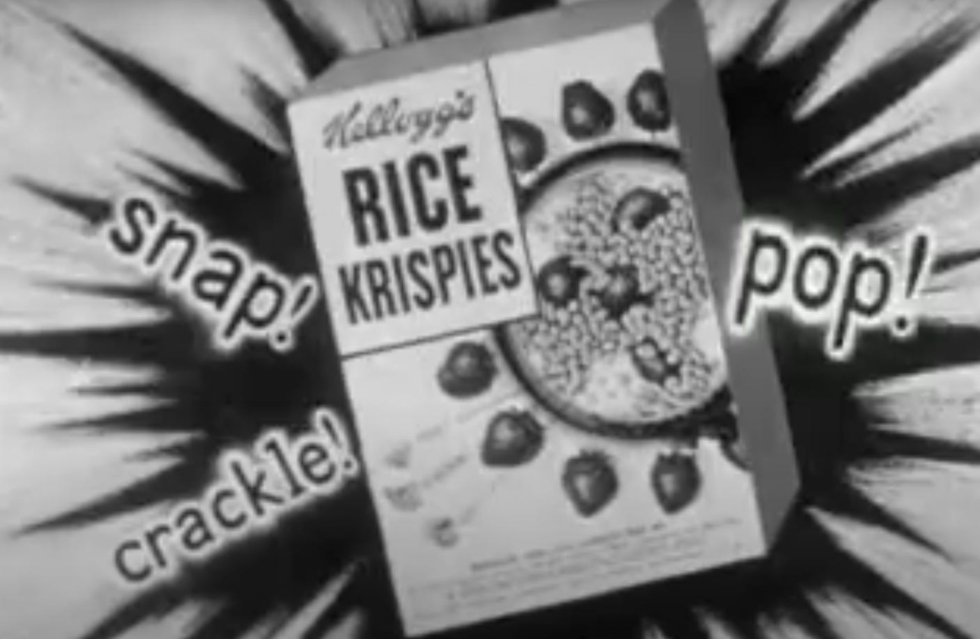
That new box really po- er, stands out. Watch the commercial here.
These weren’t even the first cereal packages to feature color graphics, just the first ones to use such large illustrations. Kellogg’s ad agency at the time was Leo Burnett, founded by the bombastic Chicago ad man famous for showing raw meat on a bright red background. “We took a round steak and slapped it on a piece of big red cardboard,” Burnett said about that campaign. “It just intensified the red concept and the virility and everything else we were trying to express about meat.” These Kellogg’s boxes followed the same sledgehammer strategy, including being taller to take up more visible space on the supermarket shelf.
From “biologic living” to “They’re gr-r-r-eat!”
On the one hand, this was a perfect example of what critics of consumerism would decry as the shallowest kind of hype job. It’s literally changing nothing about the product, just the disposable cardboard it’s packaged in, and selling it as new. But you could also say that Kellogg’s hit on a design pattern that was so effective, it quickly took over its industry - and consolidated a shift in the way Americans ate breakfast.
John Harvey Kellogg was a very 19th-century crank, deeply imbibing a characteristic cocktail of his era’s pseudoscientific fads and fancies, under an umbrella he called “biologic living”. Some turned out to be good ideas ahead of their time, like the importance of gut flora and abstinence from smoking. Some were eccentric but harmless, like observing the Sabbath on Saturday along with his fellow Seventh Day Adventists. And some were straight-up crimes against humanity, like “racial hygiene” and the forced sterilization of “mental defectives”.
Out of the sanitarium, into the kindergarten
It was an invention of his brother Will that would drum up the scratch for John to fund his ideological hobbyhorses: corn flakes. While the brothers were helping to manage an Adventist health resort in the 1890s, they started serving Will’s flaky new creation to guests. One of them, C.W. Post, liked it so much, he figured out how to replicate the process and started his own company to sell them. By 1905, his Post Toasties would make him rich.
Promoting health was all well and good, but the Kellogg boys weren’t about to sit by while somebody else made bank off of their creation. So they founded their own company in 1906, the rest is history, blah blah blah. Point is, for decades, dry cereal packaging reflected its health-food DNA. Both Post and Kellogg’s kept the boxes plain and sober, more like medicine than a yummy breakfast treat. They weren’t supposed to be pleasurable, they were supposed to be good for you.
But by 1952, both Kellogg brothers were dead. Packaged food was exploding, getting saltier and sweeter and more amplified with artificial flavorings. After 20 years of depression and war, Americans weren’t in the mood to take their medicine. The baby boom was well underway, and mass media made it easier than ever to promote directly to children. There’s no more effective sales rep than a kid cajoling their parents.
The All-Star Breakfast Show packaging was precision-tooled to ride all these trends. By the end of the year, Kellogg’s would complete the kids’ cereal marketing arsenal, adding the cartoon mascot Tony the Tiger to its new, unabashedly sweet cereal, Sugar Frosted Flakes. The company had its best year yet, with sales climbing from $133 million in 1951 to $152 million in 1952, and it would only grow from there. What that devastating effectiveness would mean for the health of American kids was a question for future decades. But the cereal aisle would never look the same.
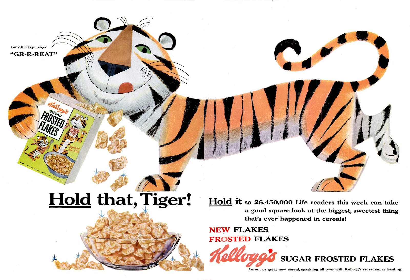
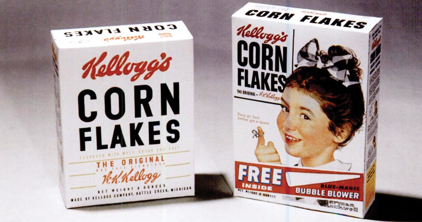
Like everything else, Tony the Tiger looked cooler in the ‘50s
As a kid I had to pick cereals where sugar wasn’t the first two ingredients, so I was walking up and down the aisle enticed by the broad exciting box fronts, but mostly staring at the nutrition stats. I usually ended up with Cheerios, while dreaming about Cap’n Crunch or Trix. What cereals did you grow up with, and what did you wish you could’ve had? Let’s hear about ‘em in this week’s Shoddy Goods chat.
—Dave (and the rest of Meh)
These past Shoddy Goods stories are a nutritious part of a balanced breakfast: